
Last night, while wired on a trace of caffeine, I saw an infographic created and shared on Facebook by the Out4Marriage organisation. Views on gay marriage range from Of course, this is the twenty-first century to I’m the MP for Wellingborough, but leaving that issue aside, the graphic disturbed me somewhat. In fact, as a fully paid-up member of the Tufte club, I gurgled something lacking in both grammar and grace.
Here’s the graphic:
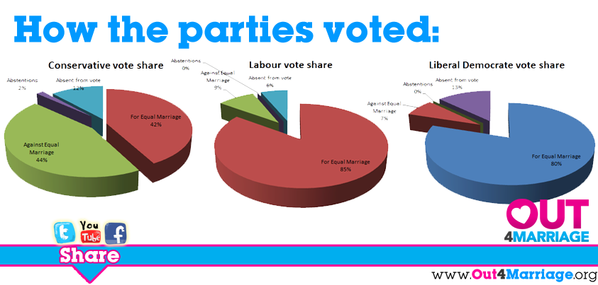
I shan’t BEGIN RANT here. Suffice it to say that all those pixels have been wasted on twelve numbers, two of which are zero. And you can’t read the labels. And the colours are inconsistent between pie charts. And they’re pie charts. And they’re 3D pie charts. And pie charts with zero-sized slices don’t make any sense. And there’s a typo “Liberal Democrate”. Here’s where I would END RANT, were I ranting, which of course I’m not.
I posted a short comment against the graphic. Here’s a screenshot with the subsequent two responses:
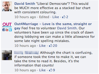
What particularly intrigues about Out4Marriage’s response is how it reminds me of the shields up ultra-defensive reply you sometimes receive from developers — especially of open source software — when you have the impertinence to report a bug in their code. The source is there — if you don’t like it, fix it yourself. And it made me wonder whether all voluntary organisations are inherently like that to some extent: deflecting any criticism by inviting you inside the tent to piss out.
Of course, whoever wrote that message also had a point. The people working on the campaign had had a long and tiring day and could be excused a typo, and tedious grammar pedants on the internet are the most tedious tedious grammar pedants since the Microsoft Word paperclip first interrupted us to insist we were writing a letter.
The subsequent comment, though, raised a caffeinated eyebrow. “If someone took the time to make it, we can take the time to read it,” this commenter says. I fundamentally disagree with that statement. It lets the creator of the graphic entirely off the hook. It says, effectively, design doesn’t matter to understanding. It says, effectively, user interface complexity doesn’t matter.
The principle of commensurate effort applies, naturally: you’ll put in the effort if the reward is good enough. You’ll master the incoherent hodgepodge of levers and sticks and buttons and dials and spinny things in a car’s user interface because you receive a huge benefit from doing so.
But an infographic like this has no great reward for deep study. It must communicate its messages simply and coherently and compellingly. Don’t Make Me Think!
For this graphic in particular you want to immediately convey the information that more Tory MPs voted against same-sex marriage than for it; that the other main parties are hugely in favour; and that a significant fraction of MPs failed to make a choice either way, and either abstained (technically, voting both for and against) or didn’t vote at all.
Three 3D pie charts with inconsistent colouring (with red/blue/green colours matching traditional party affiliations but not used as such) and labels too small for most to read even at full size absolutely do not convey that information. The message is lost in chartjunk.
And also: who is this chart for? If I were part of Out4Marriage I’d want a chart that supporters could share on their timelines for non-supporters to see and easily grasp. It’s the non-supporters — the ones who simply will not stop and squint and interpret a complex chart from an organisation they disagree with — you need to design for.
“Feel free to volunteer,” said Out4Marriage in its reply to my comment. So I did. Here’s what I created, minus the headlines and logos that you’d need to add:
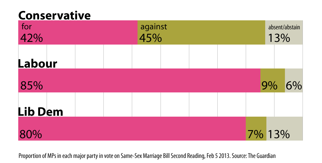
Since only one party included abstainers — the Tories — I combined them with the absentees, and so twelve numbers is reduced to nine. Three stacked bar charts with consistent colours and large labels are easy to see and understand even when shrunk into a Facebook timeline. The ‘for’ colour is taken from the Out4Marriage brand. The ‘against’ colour is contrasting, pretty much, and deliberately sickly. The ‘absent/abstain’ colour is less of a highlight but still prominent. None of the colours are associated with political parties.
Much better, I think.
(While I was creating that chart, Out4Marriage posted a newer chart that used consistent colours and included a clear legend. It still had three 3D pie charts.)
I posted another comment to the original chart, pointing to my timeline for my version and apologising if anyone was offended by my earlier comment. I hope they see it, and take notice.
Everything an organisation publishes under its name sends a message. The opponents of Out4Marriage are well-funded, sending out millions of leaflets designed and worded to convince readers to lobby their MP to vote against equal marriage. You can bet they are now redoubling their efforts, selecting data that favours their cause, even after a 400-175 vote defeat at second reading, and presenting it as if they’re on course to defeat the bill.
Design sends a message. Everyone must know what your message is. Especially you.

