
Sometimes you have an app experience that makes you wonder: has anyone involved, anyone at all, ever thought about how the app is used in practice?
Or worse: they have, and they understand it’s bad, but other factors have won?
I just put petrol in my car. I have a hybrid now and I’m semi-smug about it but I do still need dinosaur juice occasionally. I’ve been putting petrol in cars for some decades now. I know the process. I’ve got the hang of it. Nozzle off hook into hole. Wait for the pump to whirr. Squeeze until tank full or 1p over desired spend. Replace nozzle. Pay. Drive away.
But not today.
Nozzle off hook into hole. Wait for the pump to come on. It doesn’t. It’s then that I see the laminated sign sellotaped just under the LCD pricing: you must use the Shell app to pay for petrol at this pump.
No other pumps available. I do not have this app, because contrary to rumour I do not install every app.
I install the Shell app and start it. I get a standard first-run experience for apps like this: swipe through the exciting features this app offers (yes but can I just buy some petrol?), perhaps you might consider enabling notifications so we can contact you about special offers (yes but how do I pay for petrol?), tell us your first and last name (what if it was raining and I was in a hurry?), please create an account with us and be sure to choose a password with at least one upper case letter, one lower case letter, one number, and one symbol (what if I was 80?), and please select your payment method (OK now can I pay for petrol?), oh and you must check your email to confirm your address and activate your account.
I work in the computer industry. I’m a software architect focusing on customer experience in the broadest sense. I’ve been installing apps like this for 15 years. I know roughly what I’m doing. I’m not an 80-year-old retired person who uses a smartphone to WhatsApp her family, trying to do this in the dark in the rain without her right glasses.
I reach the “confirm your email address” stage when the boy behind the counter is on the tannoy saying “Man at pump 6, <garbled>”.
At this stage, I must confess, I’m starting to simmer. I point to my phone and shout “I’m installing the app”. More <garbled>.
I go to the booth. I stride purposefully. They tell me if I’m having trouble I can move to a different pump, and can I please put the nozzle back on the hook anyway. Because it turns out that when you use the app you must pay before you lift the nozzle. I do not know this because I have yet to reach that part of the onboarding experience that tells me how I pay for petrol, which I guarantee is the only thing I will ever want to do with this app.
I return to my car. Replace the nozzle. Finish setting up the app. From the home screen full of things unrelated to buying petrol, I find the button to press to buy petrol. I locate my petrol station and type in the pump number. I select an amount to pay, which confuses me because I actually want “however much to fill up my tank”, and then see the small print that says it’s a maximum.
I fill up my tank and drive away.
OK: ignoring the onboarding faff, and the stupid app home screen, it’s easy.
But you can’t ignore the onboarding faff. You can’t ignore the app home screen.
Back to my original question: how is the app actually used in practice?
Primary goal of the user: put petrol in tank, possibly filling it up.
That’s it. That should be the focus of the app.
When do people install the app? Typically in situations like mine: they’re forced to do so. Nobody sitting on their sofa on a Saturday night thinks, “Oh, let me just install the Shell app for the next time I need to put petrol in my car.”
The very first screen you see when running the app for the first time should have a big button that says “I just want to fill up and pay now”. When you press it, you should get clear instructions, starting with: make sure the nozzle is on the hook. It should set up payment as part of this process. It should end with reassurance that you can just drive away at the end.
At no point does it need your name, email address, a secure password, or any of that. Want is not the same as need.
Here’s the home screen of the Shell app for me right now:
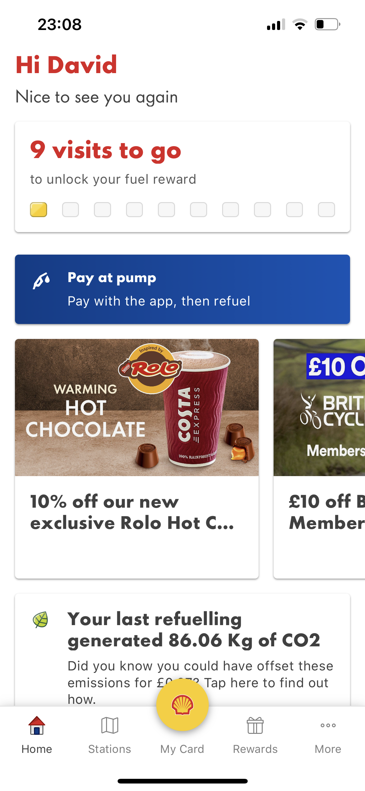
Stop downplaying the feature that enables the user’s primary goal: the narrow blue box. That should be at the top, big and bold. The wording’s fine. I’d make it fill the home screen, with tabs for everything else.
I literally could not care less about how many more visits I need to make to unlock some unspecified “fuel reward”. What is it, some money off a tank? If you want an incentive for me to use Shell every time, then drop your prices for every visit, to the same amount as the reward.
STOP GAMIFYING STUFF.
What are the user’s goals? Fill up and drive off. Solve that problem and get out of my way.
Of course the app’s product managers will say: but we want to present a smorgasbord of incredible offers available to our users, so we’ll need to collect their details for definitely-non-spamming purposes. Fine. If they’re genuinely good offers, people will sign up.
I’ve just been forced against my will to give you my contact details so I can put petrol in my car, which is a service you previously offered without such a requirement. What do I get in return? 10% off a specific hot chocolate at participating stations? That does not seem a fair exchange.
I eagerly await an email from my new friends at Shell enticing me to visit again to sample their hot chocolate, as if a Shell garage or any garage should be one of my primary lifestyle destinations. I’m over 50, I already have John Lewis.

App Clips were supposed to solve this problem. And if they wanted you to have the kind of experience you wanted, it is the closest thing.
Instead their data is going to show that yet another person was happy to go through all that for the two holy grails of apps – getting the user to sign up and in, and to tie in a payment method.
The only way you could have taught them a lesson is by refusing to install the app, giving the station staff feedback, and going to a different station.